Using SAGA for modeling Channel Flow
I used SAGA for the first time, and using its tools, modeled where stream channels are likely to form on Mount Kilimanjaro. I started with DEM data from SRTM, acquired through NASA’s Earthdata program.
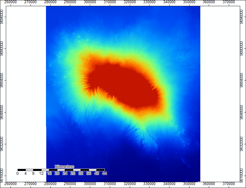
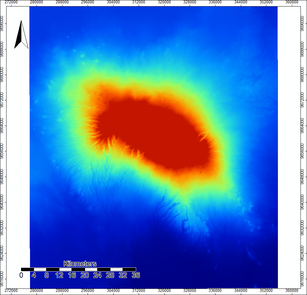
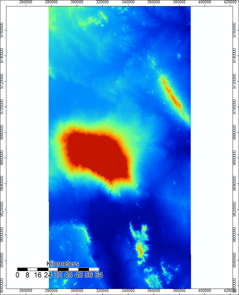
I made this map in SAGA using two SRTM rasters and mosaicking them together. Its a basic DEM that shows the elevation of Mount Kilimanjaro.
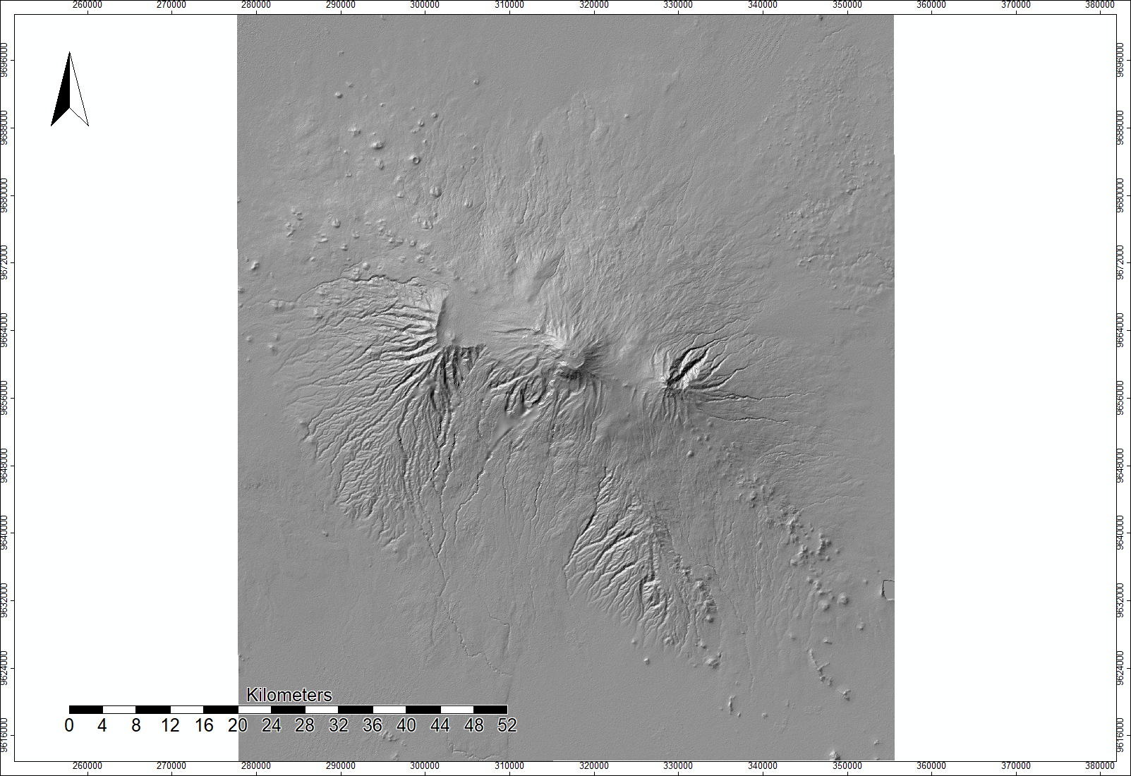
This second map is a hillshade model based on the DEM above. The azimuth is 315 degrees and the altitude is 45 degrees. I produced it using the analytical hillshading tool in SAGA.
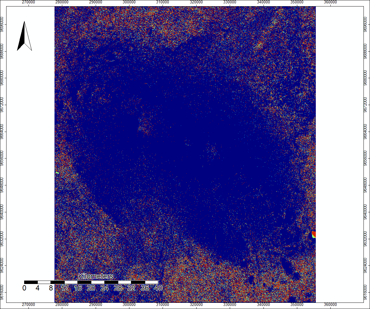
This map shows the sinks in the DEM image, and the colors indicate the different direction that water will flow in when it encounters these sinks.
This is a new DEM built from the original Mosaicked DEM and the sink routes image. Although it looks basically identical to the original DEM, it has filled the sinks so that they do not interfere with the channel mapping that I plan on using the raster for.
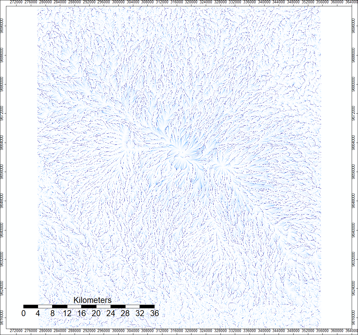
This is a map of top-down flow accumulation, which models where water would flow if water came down from above the DEM (such as rain). The opacity of the pixels indicates how many other pixels would be expected to flow into that pixel.
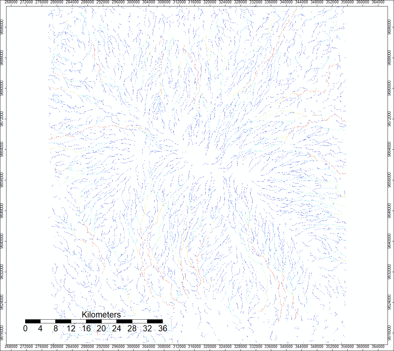
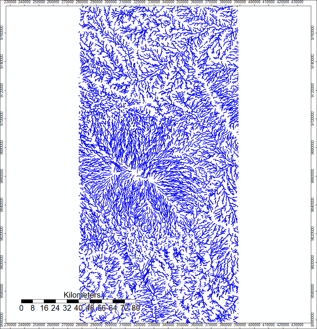
This map displays the river channels that would be expected to form in the area based on our flow accumulation raster. For the purposes of this map, we set channels to form where the water flow from over 1,000 cells was accumulating. The green and red channels indicate more cells flowing into those channels.
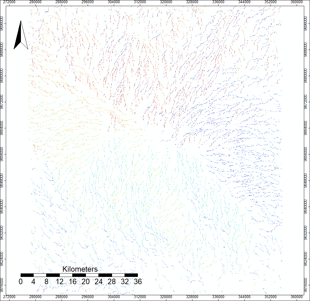
This map has the same pixels filled in as the previous map, but rather than color indicating rate of flow, color here indicates the direction in which the river is flowing.
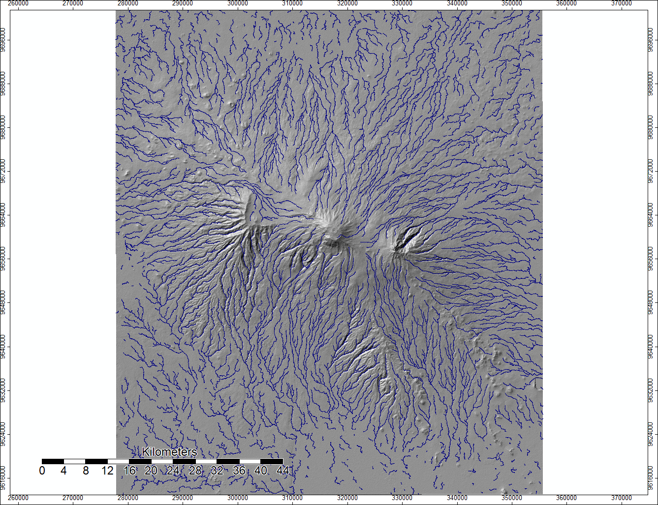
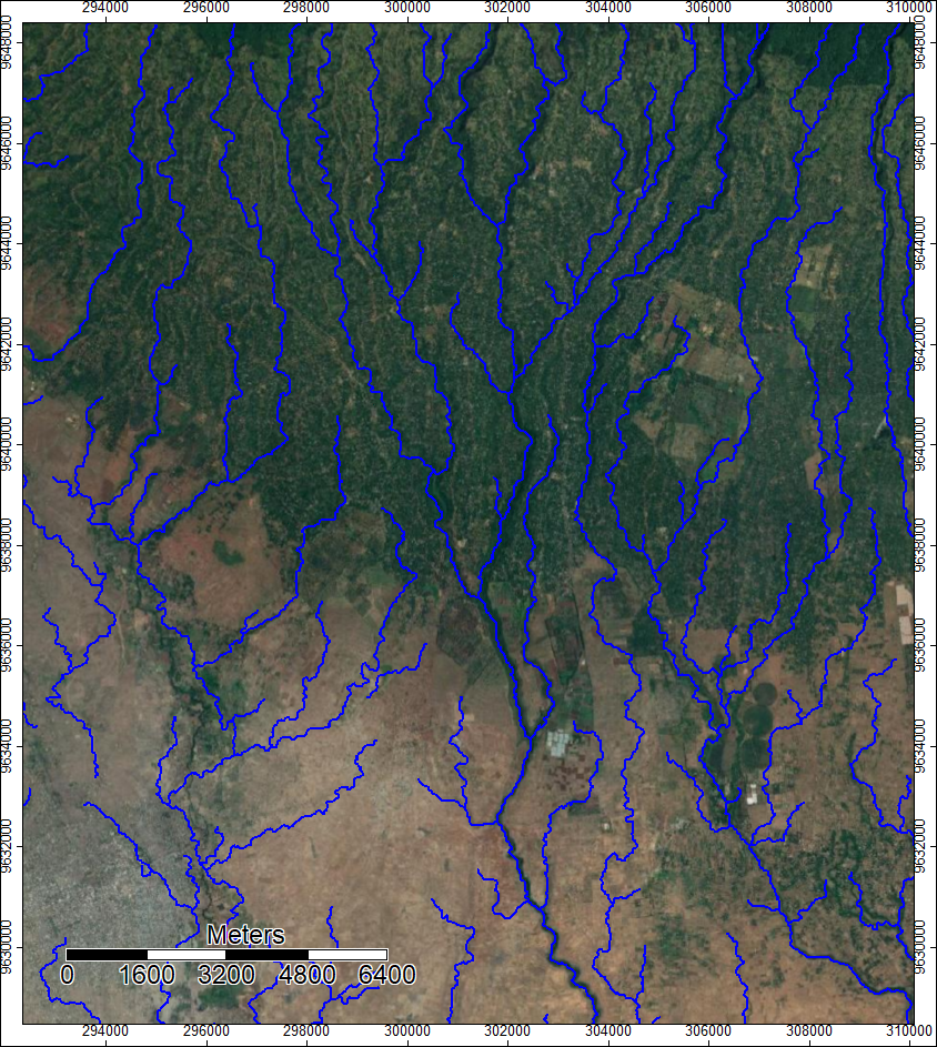
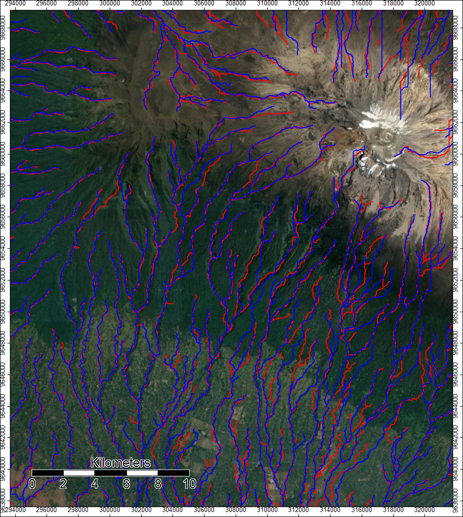
This map displays a vector version of the channel network overlaid on top of a hillshade, so that how the river channels fit into the terrain can be see. Unlike the raster channel network, the vector version cannot display the rate of flow in any of the channels.
Using Batch Processes to automate the analysis
I learned to speed up the SAGA analysis by using a batch process, for which I used a .bat file with code designed to run on the windows shell. Using information availible in SAGA on how to use command lines, I was able to code then run a batch process that did the entire hydrological analysis in the windows shell without opening up SAGA at all. I was able to produce identical outputs, and it was also extremely easy to adapt the batch process to run using ASTER data instead of SRTM data, which made doing a comparison of the two datasets much easier.
Click here for the ASTER Model and the SRTM model
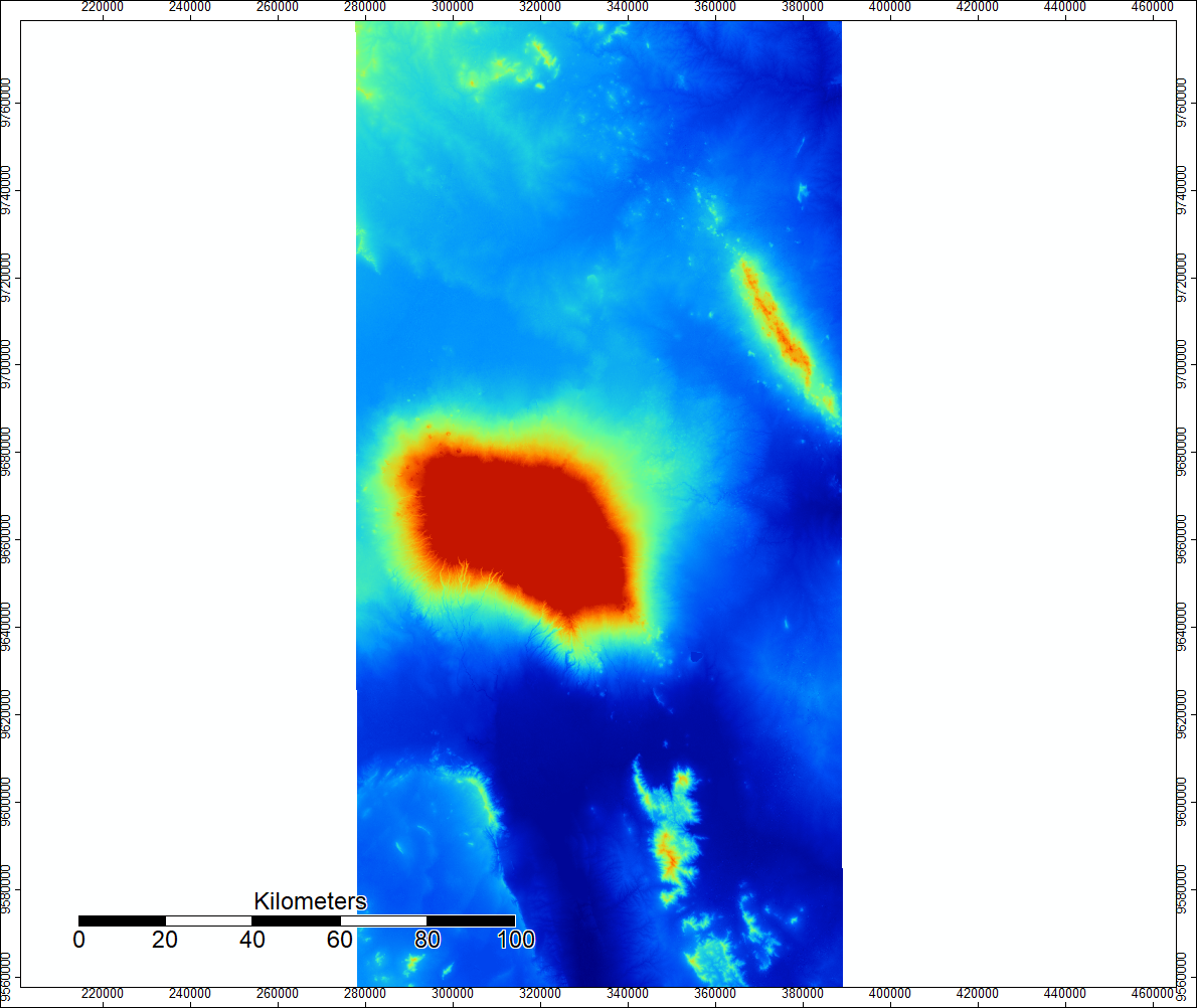
Using the batch processes, I was able to make this set of DEM and Channel Network from SRTM data, which are identical to the ones I made in the previous lab

And here are the DEM and Channel Networks produced using the same process but ASTER data
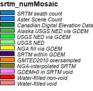
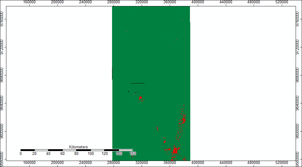
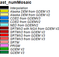
Another important piece of data I worked with these week was the .num files associated with both SRTM and ASTER. These metadata files contain rasters that tell the user the source of each pixel in the dataset, as not all of it comes from the actual data gathering mission. The .num files are often an indicator of where error might be, and can inform the user as to why that error is there. To visualize this data, I made maps of the .num files to visualize which data sources make up the rasters that I have been using to do my hydrological modeling.
This is the SRTM .num map
This is the ASTER .num map
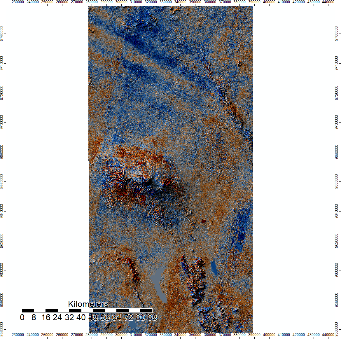
Another useful indicator of error is a comparison between the two DEM levels. The map below shows the ASTER DEM I created, with the values of the SRTM DEM subtracted from it. Red indicates SRTM was higher in that spot, and blue indicates ASTER was higher in that spot. The map is overlaid on top of a hillshade model.

After running my models, when I compare them to what is actually on the surfact of the earth there are some clear issues. Interestingly enough however, high differences between the SRTM and ASTER DEM’s do not neccessarily mean there is a signifigant difference between the Channel Networks, as seen in this image. In general, the channel networks seem to struggle the most in flat areas.
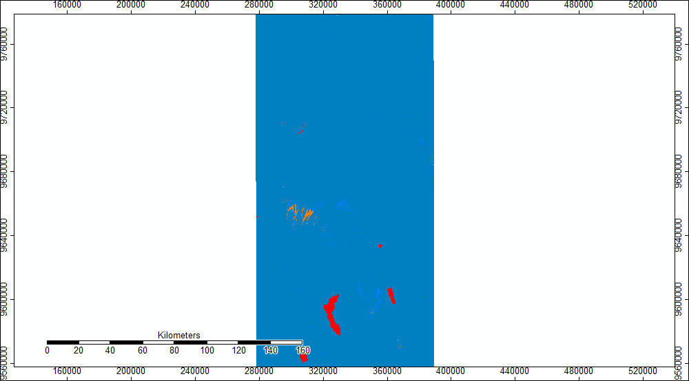
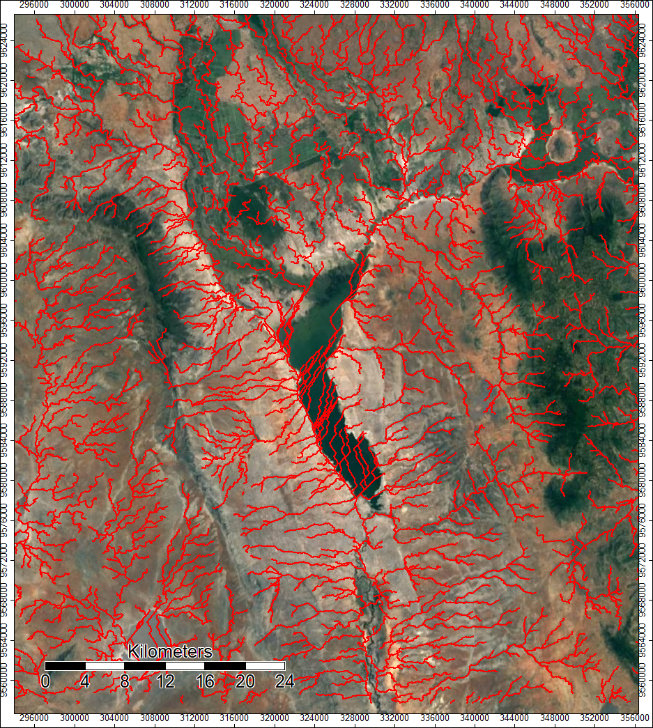
In the image below, you can see where both ASTER (red) and SRTM (blue) failed to match up to actual rivers
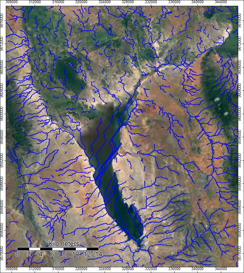
Both datasets were also confused by bodies of water on the ground, as seen in the images below, as they only registered the water as flat ground.
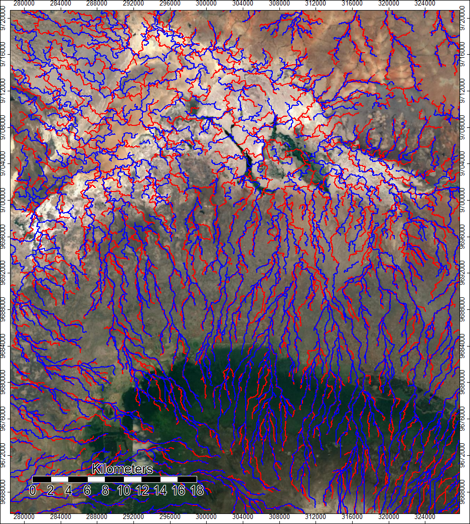
The image below shows how both datasets led to very similar channel networks in the high altitudes, but at low ground, where differences in elevation are more subtle and harder to detect, the channel networks diverged much more.
Meanwhile, in the image below, SRTM and ASTER put the channels in almost exactly the same place, even though the ravines shown in the image are the spot with the highest difference. This is likely because the ravines are deep enough that even the high difference isn’t enough to make the DEM’s think the ravinces are not there.
Both datasets produce generally similar results, and it is difficult to say which one is superior. To have a good answer would require extensive testing of error in terms of how accurate the heights are and how close the modeled channels are to the actual channels. A quick analysis would indicate that the ASTER data is better as SRTM has a signifigant amount of land area filled using oversampled data, which are also the spot of the highest difference between the SRTM and ASTER data. The ASTER data also seems to get less confused by bodies on water when doing the hydrological analysis.
Below is a map showing the differences in flow accumulation, another indicator of where error occurs. It is a large scale map because the map is unreadable at the full extent of the image, but this map shows how some pixels are seen as high flow accumulation in ASTER (red pixels, darker red indicates more flow accumulation), while others are higher in SRTM (blue).


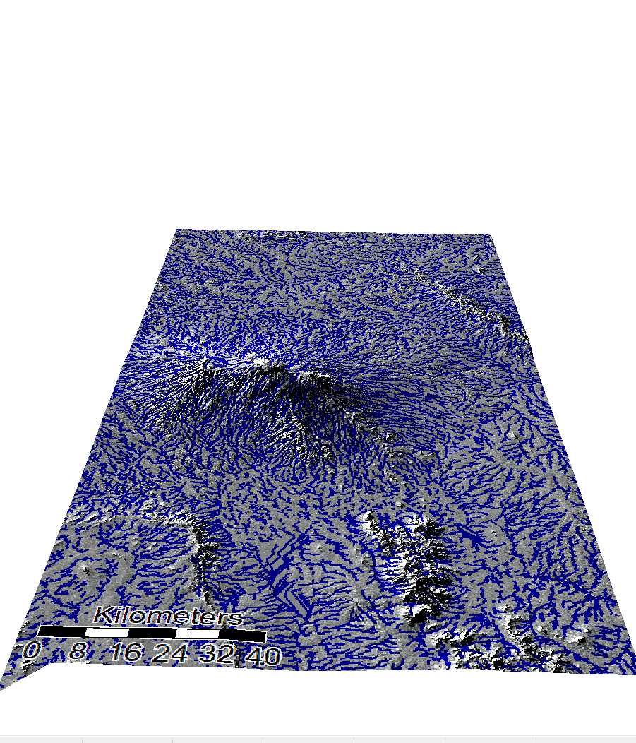
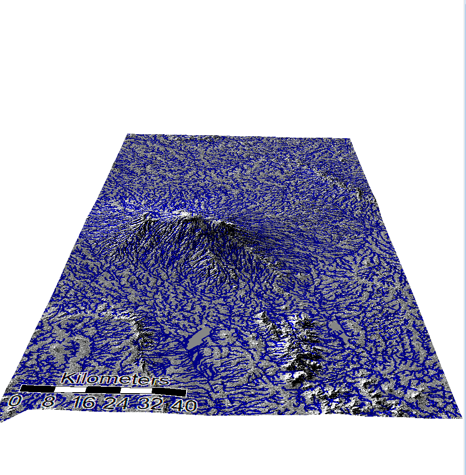
Here are some cool 3D visualizations of the channel networks on the hillshade models
SRTM 3D
ASTER 3D
This work was all done with SAGA 6.2
NASA/METI/AIST/Japan Spacesystems, and U.S./Japan ASTER Science Team. ASTER Global Digital Elevation Model V003. 2019, distributed by NASA EOSDIS Land Processes DAAC, https://doi.org/10.5067/ASTER/ASTGTM.003
NASA JPL. NASA Shuttle Radar Topography Mission Global 1 arc second. 2013, distributed by NASA EOSDIS Land Processes DAAC, https://doi.org/10.5067/MEaSUREs/SRTM/SRTMGL1.003